
| Focus Area | Goal | Expected Outcome |
|---|---|---|
| Visual Cues | Differentiate LASA drugs | Reduced selection errors |
| Standardization | Align across all systems | Consistency between EHR and labels |
| Integration | Combine with barcode scanning | Defense-in-depth safety |
What Exactly is Tall-Man Lettering?
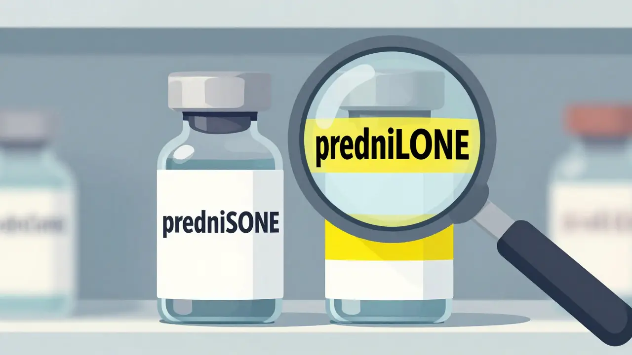
Tall-man lettering is a technique where specific parts of a drug's name are capitalized to distinguish it from another drug with a similar name. For example, instead of writing "prednisone" and "prednisolone," a pharmacy would write "predniSONE" and "predniSOLONE." The capitalized letters act as a flag, alerting the clinician to the specific part of the word that makes the drug unique.
This isn't just a random style choice. The Institute for Safe Medication Practices (ISMP) coined the term back in 1999 to tackle a persistent problem: the roughly one medication error per 1,000 orders that stem from name confusion. Shortly after, the U.S. Food and Drug Administration (FDA) launched the Name Differentiation Project in 2001 to systematically evaluate which drug pairs need this visual help.
Why Your Facility Needs This Strategy
Humans are prone to "confirmation bias." When we expect to see a certain word, our brains often skip over small differences and see what we expect to see rather than what is actually there. In a fast-paced clinic, a nurse might glance at a label and see "hydromorphone" when they actually have "morphine" in their hand because both start and end similarly. Tall-man lettering breaks this pattern.
The evidence is compelling. An eye-tracking study by the ISMP showed a 35% reduction in selection errors when providers used tall-man lettering compared to standard lowercase names. It reduces the cognitive load on the staff, meaning they don't have to spend as much mental energy squinting at labels to ensure they have the right dose of the right drug. For a nurse practitioner, seeing the capitalized "SONE" in predniSONE immediately signals it's not predniSOLONE, removing the need for a second or third double-check in the heat of the moment.
How to Implement Tall-Man Lettering Step-by-Step
Setting this up isn't as simple as just typing in caps; it requires a systemic approach to ensure you don't create *new* confusion. Based on successful hospital protocols, here is the best way to roll it out:
- Form a Safety Working Group: Bring together pharmacists, IT specialists, and nursing leads. You need people who understand both the clinical risk and the software limitations.
- Select Your Master List: Don't make up your own capitalization patterns. Use established lists like the FDA's Name Differentiation Project list or Australia's National Mixed-Case Lettering List. This ensures that if a staff member moves between departments or facilities, the visual cues remain the same.
- Audit Your Systems: Identify every touchpoint where the drug name appears. This includes:
- Computerized provider order entry (CPOE) systems
- Electronic Health Records (EHR) like Epic Systems or Oracle Health (formerly Cerner)
- Automated dispensing cabinets (e.g., Pyxis)
- Physical prescription labels and shelf tags
- Execute the Update: Work with IT to push the changes. Ensure the font used doesn't make the capital letters look like symbols or blend into the lowercase letters, as this defeats the purpose.
- Monitor and Adjust: Track "near-misses." If staff are still mixing up two specific drugs, you may need to adjust the lettering or add a secondary alert.
The Pitfalls and Limitations
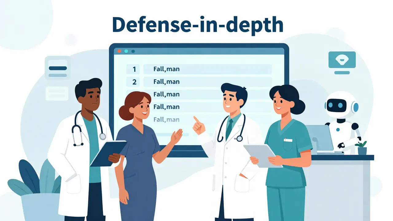
It's a common mistake to think tall-man lettering is a total cure for dispensing errors. It is not. Dr. Michael Cohen from the ISMP emphasizes that this is just one layer of a "defense-in-depth" strategy. If you rely on it exclusively, you're leaving your patients at risk.
One major issue is inconsistency. If your EHR shows "PARoxetine" but the pharmacy label shows "parOXetine," the staff gets confused, and the safety benefit vanishes. Furthermore, it doesn't work well for drugs that are identical at the start. For instance, "metoprolol" and "methyldopa" both start with "met-," and if the differentiation happens too late in the word, a rushed clinician might still grab the wrong one.
There is also the risk of a "false sense of security." Some experts argue that while tall-man lettering is helpful, it's less effective than "forcing functions"-software blocks that literally prevent a user from proceeding until they acknowledge a high-risk drug warning.
Comparing Global Standards
Depending on where you practice, you'll see different lists and recommendations. While the goal is the same, the specific letters capitalized can vary.
| Organization | Focus/Scope | Example Pattern | Update Frequency |
|---|---|---|---|
| FDA | US-based, focused on established drug names | vinBLAStine vs vinCRIStine | Quarterly |
| ISMP | Global safety advocacy, larger drug list | HYDROcodone vs oxyCODONE | Quarterly |
| AU Commission | Australian National Mixed-Case Lettering List | Based on local incident data | Periodic (e.g., 2022 revision) |
Looking Ahead: AI and the Future of Safety
We are moving toward a world where the system does the thinking for us. Some facilities are already piloting AI-enhanced systems that dynamically change capitalization based on real-time error data. If a specific drug pair is causing a spike in near-misses in a certain ward, the AI can make the tall-man lettering even more prominent or trigger a mandatory pop-up alert.
However, technology can fail. Power outages happen, and software glitches occur. This is why the physical application of tall-man lettering on labels and shelves remains critical. Even as barcode scanning becomes universal, the human eye is the final check. Ensuring that the eye sees a clear distinction between two dangerous chemicals is a low-cost, high-impact way to save lives.
Does tall-man lettering actually reduce patient harm?
The evidence is mixed but generally positive for reducing *selection* errors. While a Cochrane review rated the certainty of reducing actual patient harm as "low," eye-tracking studies and pharmacist feedback show it significantly reduces the chance of a clinician picking the wrong drug from a shelf or menu. It is most effective when used as part of a larger safety system including barcode scanning and double-checks.
Where can I find the official list of drugs that need tall-man lettering?
You should use the lists provided by the FDA (for US standards), the ISMP (for a broader, safety-focused list), or the Australian Commission on Safety and Quality in Health Care's National Mixed-Case Lettering List if you are practicing in Australia. Avoid creating your own internal list to ensure consistency across the healthcare continuum.
Is it expensive to implement this in a hospital?
Generally, no. The cost is primarily in the IT labor required to update the database and the time spent auditing systems. In Australia, implementation costs have averaged around AU$1,200 per hospital system, making it one of the most cost-effective safety interventions available.
What are LASA drugs?
LASA stands for "Look-Alike, Sound-Alike." These are medications that either have very similar names (like prednisone and prednisolone) or sound similar when spoken over a phone or in a noisy environment, which significantly increases the risk of a dispensing or administration error.
Can tall-man lettering be used for brand names?
Yes. While it is most commonly used for generic active ingredients, it can and should be applied to brand names that are easily confused. Some hospital implementations have modified both active ingredients and brand names to cover all possible points of confusion.
Next Steps for Pharmacy Managers
If you're just starting, don't try to boil the ocean. Start by identifying your "Top 20" most confused drug pairs based on your own facility's incident reports. Apply tall-man lettering to those first, then expand to the full FDA or ISMP lists. Coordinate with your IT vendor to ensure that the capitalization persists across all screens-from the doctor's tablet to the pharmacist's workstation and finally to the printed label. This consistency is what transforms a simple typographic change into a life-saving safety barrier.